Personal Trainer Logo: A Small-Size Test for Your Brand
Personal trainer logo ideas for a clear profile icon and flyer. Compare marks at small size, choose a visual direction, and prepare files for print.
By Ultimate Coaching Kit by Cosmo Suite · Editorial policy
Published · 8 min read
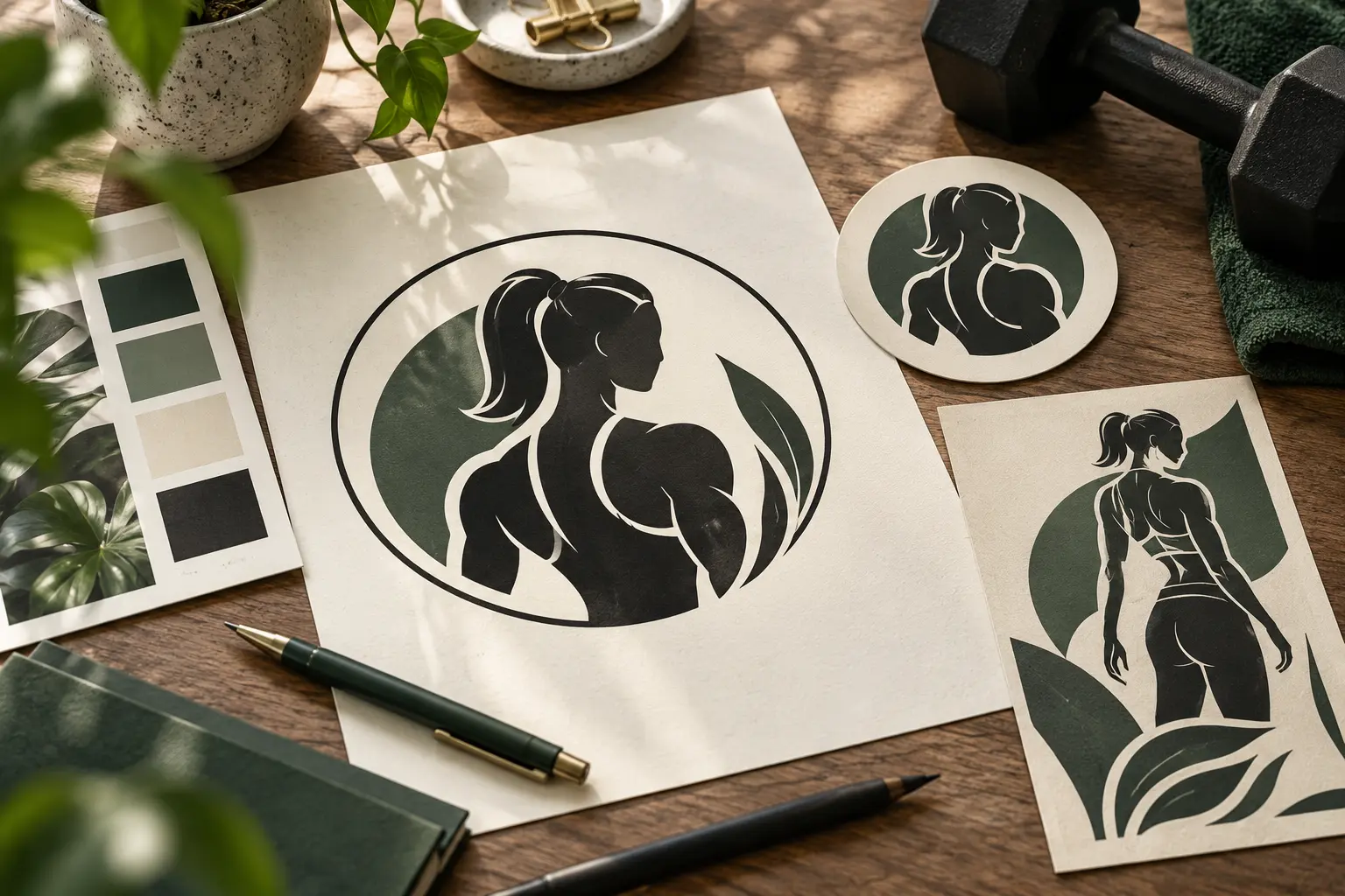
A logo can look sharp on your laptop and turn into a dark dot in a profile circle. That is a frustrating surprise when you have already picked colors, chosen a typeface, and built the rest of your coaching materials around it. If you are assembling matching materials too, explore the Ultimate Coaching Kit.
Start with the smallest place people will see the mark. Then choose the symbol, name treatment, and color that still read there. This guide uses a fictional strength coach to show how to shape a personal trainer logo for a profile icon, a flyer, and the header of a workbook. The example is a design exercise, not a real coach or a promise about client response.
Choose a logo direction by where it must work
A useful personal trainer logo is one people can recognize across the places you use it. Begin with the job it must do, then choose the simplest version that does that job.
| Use | What needs to stay clear | Starting point | Check |
|---|---|---|---|
| Profile icon | Name or distinctive mark | Initials or simple symbol | Crop it to a circle and shrink it |
| Flyer | Coach or practice name | Wordmark or combination mark | Print a draft at actual size |
| Workbook header | Consistent identity | Compact mark with a short name | Check it beside the page title |
| Social post | Recognition across a series | Small corner mark or name | Make sure it does not compete with the message |
If you need one option for all four, start with a wordmark and a compact companion mark. The wordmark carries your name where there is room. The smaller mark gives your profile and page header a recognizable cue.
Start with the signal your coaching brand needs
Decide what a new visitor should understand before you search for icons or fonts. A logo cannot explain your full service, so it should support the first impression made by your name, profile, and offer.
Write down three things before opening a design tool:
- Who you coach: for example, adults returning to strength training.
- What your coaching emphasizes: for example, guided strength sessions with a steady pace.
- Where people first see your name: for example, a profile icon or a studio flyer.
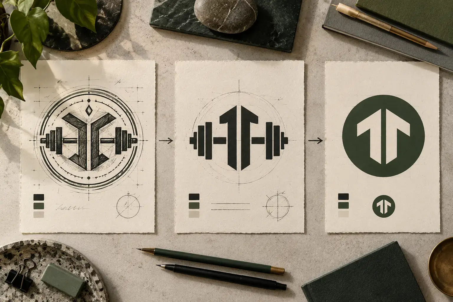
Imagine a fictional coach named Maya Reed who works with beginners returning to strength training. A detailed badge with a barbell, three stars, a mountain, and curved lettering might signal “fitness” in a broad way, but it gives the eye several things to decode. A cleaner option could use “Maya Reed” in a sturdy wordmark with a short barbell line as the only symbol. Another could pair the initials MR with the full name on print materials.
The point is not to avoid familiar equipment icons at all costs. It is to choose one that reflects your actual coaching focus. A running coach, mobility coach, and strength coach may all work in fitness, yet they do not need the same logo cue. A symbol picked only because it appears in many gym designs can make your materials look interchangeable.
Choose a mark that survives the 40 px test
Reduce the logo to about 40 pixels wide on screen as a quick design test. This is a working check, not an Instagram requirement. If the main shape or initials disappear at that size, simplify the mark or use a compact version.
Wordmark: your name does the work
A wordmark is a logo built from the coach or practice name. It works well on flyers and workbook covers because the full name can stay readable where there is room. Adobe’s logo design guide also recommends thinking through the brief, color, and type before settling on a finished mark. Test the actual name at the likely display size. Long names may need a shorter line break or a separate compact option.
Monogram: initials in a small space
A monogram is a mark made from one or more initials. It gives you a compact option for an avatar or header. Use letters that are easy to tell apart. Watch out for letter pairs that merge when the strokes touch or the mark is reduced. Put the full name nearby in the profile, flyer, or document so new visitors do not have to guess what the letters mean.
Symbol: one clear visual cue
A symbol is a graphic mark used with or instead of the name. It can communicate a category quickly, but a highly detailed drawing loses parts as it shrinks. Keep the silhouette simple. Look at it in black and white before settling on color. If the idea depends on tiny text, thin outlines, or several small objects, it needs another pass.
Combination mark: name and symbol together
A combination mark pairs the name with an icon or monogram. It can work across more situations if the pieces can also be used separately. If you are working in Canva, its logo maker is one place to explore layouts, but review the current terms for any elements you choose. Make a wide version for a flyer and a compact version for a profile. Do not squeeze the full logo into a circle just to preserve every element.
Build a compact color and type system
Choose colors and type for readability first, then use them consistently on the materials around the logo. Two colors and a clear type pairing are often easier to manage than a large palette with several display fonts.
A simple starting system might use one main color, one supporting color, and a neutral background. Check the logo on light and dark surfaces. Also view a single-color version. If its shape only works because of a particular gradient or shadow, the design may be carrying too many effects.
For text that sits over a colored background, check contrast rather than trusting a screen preview. The W3C's contrast guidance explains minimum contrast requirements for web text. Those requirements do not automatically certify a logo, and this article is not an accessibility audit. The useful habit is to make text in your surrounding materials easy to read.
Use typefaces that suit the way you coach and remain legible at their intended size. A condensed display face may give a flyer energy, while a simpler supporting face can keep the service details calm. Avoid using a different font for every line. A logo is easier to repeat when you can describe its type choices in one sentence.
Check the logo on coaching materials
A mark is ready for use when it holds together in the places your audience meets it. Make three quick mockups before you apply it everywhere.
- Profile: place the compact mark inside a circle crop. Leave room around the edges so the crop does not cut the letters or symbol.
- Flyer: place the wider version above the service name and booking details. Check that the logo is not competing with the offer.
- Workbook: place the mark beside a page title. It should identify the material without taking space away from the exercise.
For Maya's fictional strength-coaching example, the initials version may work in the avatar, while the full wordmark can lead a flyer. On the workbook page, a small single-color mark can sit near the title. These are separate placements of one identity, not three unrelated designs.
Print the flyer at its intended size if you will hand it out or display it at a studio. Thin lines can appear weaker on paper than they looked on screen. If a symbol is hard to recognize, make the strokes heavier or choose a simpler shape. Keep phone numbers, email addresses, and service descriptions as separate text so you can update them without rebuilding the logo.
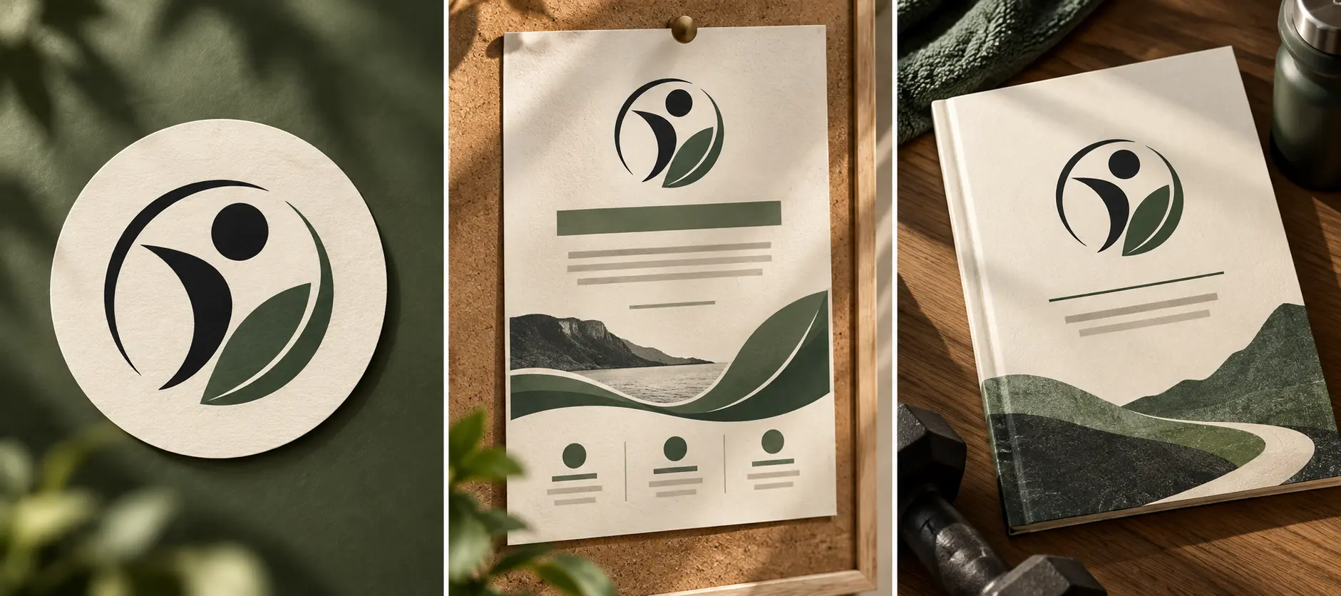
If the logo appears with text on a flyer, check the spacing and contrast around the full combination. For a workbook, see this page-by-page coaching workbook template guide and the steps for creating a workbook in Canva. On a flyer, keep the offer and booking details separate from the logo so you can update them without redesigning the mark.
Prepare a small set of logo versions
A practical logo folder needs enough options for your real uses, not every possible variation. Keep the versions you actually use together and label them clearly.
| Version | Where it can help | Before you use it |
|---|---|---|
| Full name and symbol | Flyer, cover, larger header | Check spacing and balance |
| Compact symbol or initials | Profile icon, small header | Check the circle crop and small preview |
| One-color version | Simple backgrounds or print | Confirm the shape remains clear |
| Light or dark version | Different background colors | Preview on the exact background |
Export options depend on the editor and your account. Use the format the destination needs, then reopen the exported file and inspect it. A transparent background can be useful when the editor provides it, but do not assume every file has one. If another person will print the artwork, ask which format and dimensions they need before sending it.
Keep a copy of the editable design and note the colors and typefaces you chose. That makes it easier to match future flyers and workbooks. Check the terms for any template, font, or graphic you use, especially before selling the design itself or promising exclusive use. A logo template is a starting point, not a trademark clearance search.
When a logo template can help
A template can save time when you want to compare directions before building a full brand system. Look for editable layouts that give you room to change the name, symbol, and color. Then run the small-size and print checks above instead of choosing from the thumbnail alone.
Ultimate Coaching Kit includes Logo Templates and Coach Print Maker among its Canva kits. It is a set of design materials for coaches, not a logo agency or trademark service. You can review the Ultimate Coaching Kit overview to see where logo and print materials fit with the other coach resources, or visit the Ultimate Coaching Kit site to explore the kit.
This article is published by Ultimate Coaching Kit by Cosmo Suite. Read the editorial policy for how this site prepares its guides. General design guidance was checked against Adobe Express, Canva, and W3C pages on November 2, 2026.
Before you put the mark on a profile or print materials, check that the name or symbol reads in a small preview, the circle crop leaves breathing room, and the one-color version still makes sense. Use the same identity on the flyer and workbook, and confirm the file and usage terms for every template element. If a version fails one of those checks, adjust it and inspect it again. Your logo can give the materials a consistent signature; the service details and your coaching work explain what you offer.
Frequently asked questions
What should a personal trainer logo include?
Start with a name or short wordmark and one visual cue that fits your coaching style. Add only details that remain clear at the smallest size where people will see it. Keep contact details, services, and calls to action on the flyer or profile text, not inside the logo.
How do I make a fitness coach logo look professional?
Use a simple mark, deliberate spacing, and a small color and type system that repeats across your materials. Preview the logo in a profile circle and on a printed page. Professional means clear and consistent for the audience you serve, not a guarantee of client response.
Should my trainer logo use a dumbbell or barbell?
Use equipment only if it helps people understand your particular service. A barbell can fit a strength coach, while a mobility or running coach may need a different cue. Compare the symbol with a wordmark or initials so the logo does not rely on a familiar gym icon alone.
What colors work for a personal trainer logo?
Choose colors that suit your audience and remain distinct when placed on light and dark backgrounds. Check text and background contrast, then test a one-color version. Color meanings are not universal, so use your own client context instead of relying on fixed rules.
Can I use one logo on Instagram and a printed flyer?
Use a consistent identity, but prepare a compact version for a circular profile crop and a larger version for print. Check the crop and the printed result at actual size. Keep small text and contact details outside the logo itself.
Can I use a logo template for my coaching business?
A template can help you explore layouts and create a starting point. Change the name, colors, type, and symbol to fit your work, and check the template's terms before using or distributing the result. A template does not replace a trademark search or legal advice.